Hypertext Markup Language (HTML) provides the basic description of the structure of a web page, i.e. how its content is layed out on the page to add meaning.
The markup tags used by HTML have a simple, regular structure.
HTML Elements
HTML documents are built from a set of elements,
which are its basic units.
There are two types of elements used by HTML:
those that are containers for text and/or other elements, and those that are stand-alone.
Container Elements
Container elements generally begin with an opening tag and end with a closing tag:
<tagname>....</tagname>
The distinguishing difference between the two tags is the "/" preceding the name in the closing tag.
We have seen one example of a container element already, the paragraph:
<p>This is a sentence of text that will be formatted into a paragraph.</p>
This is a sentence of text that will be formatted into a paragraph.
Stand-Alone Elements
Elements that stand alone to provide some particular function consist of just a single tag:
<tagname>
An example of a stand-alone element is the horizontal rule, defined by the tag <hr>:
This is a sentence of text that will be separated from its neighbor by a horizontal rule.
<hr>
This is the next sentence.
This is a sentence of text that will be separated from its neighbor by a horizontal rule.
This is the next sentence.
Element Attributes
Both container and stand-alone elements can have >attributes that modify their behavior in some way.
Attributes follow the tag name (in the opening tag of a container element) and consist of a space-separated list of the attributes’ names, which are usually followed by an = sign and a value surrounded by quotation marks, viz.
The http-equiv= attribute generally precedes instructions or information for browsers or search engines,
while the name= attribute is typically intended for human editors.
The information in the document head is never displayed on the web page.
Document Body
After the head element, if the document has any content to display,
it will reside within the body element:
<body>....</body>
Even within the body, if text is contained inside a stand-alone comment element, it won’t display:
<!--....-->
The rest of this document will describe the multitude of elements that go inside of the body element.
Document Structure
All together in a document, the HTML code will look something like:
<!DOCTYPE html PUBLIC "-//W3C//DTD HTML 4.01//EN" "http://www.w3.org/TR/html4/strict.dtd">
<html>
<head>
<title>
A Very Simple Document
</title>
<meta http-equiv="keywords" content="html, simple, class"> <meta name="author" content="My Name">
</head>
<body>
Isn't HTML simple?
<!--
We will see.
-->
</body>
</html>
Because many HTML elements are containers of text and other elements, all elements in an HTML document have a hierarchical or "family" relationship to each other.
Whenever an element is contained inside another element, the former is called a descendant element and the latter an ancestor element (relative to each other).
In the document example, the <title> and <meta> elements are descendants of the <head> element, as well as the <html> element.
The <head> and <body> elements are descendants of the <html> element only.
If a descendant is exactly one level below its ancestor, then we say the former is a child element and the latter a parent element (relative to each other).
So, the <title> and <meta> elements are children of the <head> element, and the <head> and <body> elements are children of the <html> element.
The consistent indentation format shown above will help you keep track of the relationships of the various elements.
1.1. Exercises
From the Applications menu, start the program NotePad (on Windows) or TextEdit (on a Mac) ;
From the File menu, open a new document;
Save it with a name such as "class.html";
Type in the HTML above (or something similar);
Save it again and close the application.
Open a browser such as Netscape Navigator, Mozilla, Firefox, Safari, or Internet Explorer to view the page.
Under the View menu, choose "View Source" (or something similar) to verify you are looking at the same document.
To see one advantage of using Dreamweaver:
From the Applications menu, start up Dreamweaver;
From the File menu, open a new document; it should begin in Design View.
Switch to Code View to see the default structure provided.
How does it differ from the code you created by hand?
Try out the Split View.
Text is a fundamental part of most web pages.
Bits, Bytes, and Hexadecimals
All computer documents are built from numbers, so a few numerical units will show up from time to time when discussing HTML and, in particular, the text it can display.
The smallest unit of computer code is a bit (binary digit), which has one of two values, 0 or 1.
Computers group eight bits together into a byte, which can have 28 = 256 values.
Because 256 also equals 162, every byte value can be simply represented by a pair of hexadecimal numerals:
0, 1, 2, 3, 4, 5, 6, 7, 8, 9, A = 10, B = 11, C = 12, D = 13, E = 14, and F = 15 .
To distinguish hexadecimal numbers from decimal numbers, they may be preceded by the letter x, for example:
x20 = 32
x5A = 90
xBF = 191.
In a hexadecimal pair, the first numeral represents a factor of sixteen and the second a factor of one:
xGH = G * 16 + H * 1 .
Question: What is the hexadecimal representation of 175? Of 255?
Letters, digits, punctuation, and other text characters are represented on computers by a particular mapping of byte values, called a text encoding or character set.
The most common character set used by western European languages is probably ISO-8859-1, also known as Latin-1, which uses one byte per character (see the table at the right).
The first half of Latin-1 is known as Basic Latin, and it’s the same as an earlier seven-bit character set called ASCII.
There are many other one-byte encodings in use, as well as two-byte (16-bit) encodings used by some Asian writing systems with large numbers of ideograms.
Increasingly common is a four-byte (32-bit) encoding called the Universal Character Set (UCS) or Unicode, which is intended to include all characters and symbols in every language in the world, whether cultural or technical.
The lowest byte of Unicode is the same as Latin-1, and so there is a more compact rendition of Unicode called the Unicode Transformation Format 8 (UTF-8); it uses a single byte for the Basic Latin characters and defines two-, three-, and four-byte sequences for the less common characters.
Web browsers generally understand a large number of character sets; menu View and then select something like Text Encoding or Character Set to see what’s available.
The availability of different character sets and the method by which they are typed into a document will vary from operating system to operating system and from program to program, so we won’t cover that here, but see the next section for an HTML approach to occasional inclusion of symbols.
To ensure that a web browser will know how to interpret the text in your document, it is highly recommended that you define the character set in the Document Head with a Content-Type statement:
Because HTML reserves the characters < and > for element tags, it needs to provide an alternative if you actually want those characters to appear in your text, e.g. in mathematical expressions:
<body>
x < y & x > z
</body>
x < y & x > z
HTML therefore defines special sequences of characters called character entity references that can be used in their place:
<
<
less than
>
>
greater than
&
&
ampersand
"
"
double quote
Because character references are introduced by the ampersand character &, the third character entity above is defined so it can appear in text, too.
On occasion you may also want to include a double-quote in an element attribute’s value, and therefore HTML provides the fourth character entity above.
HTML also generally defines numeric character references that use the character’s byte code, in the format &#d; for decimal values or &#xH; for hexadeximal values:
While the last character is not officially recognized by HTML, it is available in Unicode and is correctly displayed by more recent operating systems and browsers (if a font containing it is available).
In Dreamweaver’s Design Mode, when you type these characters in with the usual operating system method (e.g. option-o on the Mac for ø), they will usually be replaced automatically by their character entities in the underlying HTML.
Anonymous Text
As with most printed documents, text will likely be at the foundation of most of your web pages.
As such, text per se does not require special HTML tags to introduce it, other than the <body> element described earlier that makes it visible on the web.
“Just plain” text is therefore sometimes called anonymous, to distinguish it from text contained within in-line elements such as the phrase elements we will discuss shortly.
Text Spacing
Browsers generally format text as you would expect, e.g. wrapping it at the edge of the page.
One feature of HTML you should be aware of, though: a contiguous set of spaces, tabs, and newlines (called white space) will be automatically reduced to only one space.
Paragraphs and other block container elements (to be defined later) will generally also remove any white space after opening tags and before closing tags:
<p> Text with lots of spaces
and newlines. </p>
Text with lots of spaces
and newlines.
To force a particular number of spaces you must use the non-breaking space, which is entered as the character entity " ".
In Dreamweaver Design View, you can enter this character as "option-space" on a Mac or "control-shift-space" on Windows.
Generally speaking there are more meaningful ways to control spacing using various block elements or Cascading Style Sheets, so think of that first!
The Break Element
The understanding of content can often be enhanced by beginning a new line at appropriate points.
Since HTML interprets newlines as white space,
if you want to generate a new line within displayed text,
you must use an in-line, stand-alone break element <br>:
<p> Text with
lots of
spaces<br>and newlines. </p>
Text with lots of spaces
and newlines.
Now the flow of the content is a little easier to follow, but the context is unbroken.
In Dreamweaver Design View, you can enter a break element with "shift-return" on a Mac or "shift-enter" on Windows.
Again, there are often more meaningful ways to provide new lines,
for example by using a paragraph element to start a new idea, so consider that first!
1.2. Exercises
Open the previous document with Dreamweaver;
Switch to Code View;
In the body of the document type in a sentence and include some character entity references as well as some numeric character references;
Switch to your browser and view the result;
Now return to Dreamweaver and add some non-breaking spaces and line breaks;
Switch to Preview Mode to view the result.
Phrase elements can add extra meaning to text.
Adding Meaning to Text Phrases
Beyond ordinary text, writers often wish to add additional meaning to some of the text they are composing:
to provide emphasis;
to create even stronger emphasis;
to designate a definition;
to specify computer code;
to indicate a citation to a book or web page;
etc.;
Over time typographers have used a variety of techniques to distinguish these phrases,
but they have not always been consistent in their use.
For example, definitions are sometimes in italics and sometimes in bold face, and italics might also mean a citation.
New media provide even more options.
For example, with color computer screens so prevalent, why shouldn’t emphasis be displayed in a light purple and
a stronger emphasis in a fiery red,
without a change in typeface?
And then for those who can only listen, there are screen readers that use intonation rather than font face to indicate emphasis; how would they know what italics is supposed to mean?
Phrase Elements
The best way to add meaning to text phrases is not to directly designate them as being bold or italic or a particular font, but to instead contain them in meaningful in-line phrase elements:
This line will have some <em>Emphasis</em>.<br>
And this will have even <strong>Stronger Emphasis</strong>.<br>
This one will be a <dfn>Definition</dfn>.<br>
And this will contain some <code>Computer Code</code>.<br> And here's where you can input data from your <kbd>Keyboard</kbd>.<br>
And finally, a citation: <cite>Dynamic HTML: The Definitive Guide</cite>.
This line will have some Emphasis.
And this will have even Stronger Emphasis.
This one will be a Definition.
And this will contain some Computer Code. And here's where you can input data from your Keyboard.
And finally, a citation: Dynamic HTML: The Definitive Guide.
A browser will usually give phrase elements the most common style (e.g. in the first two cases above).
However, using Cascading Style Sheets, the particular style used to represent that meaning can be changed easily and generally (as in the third case).
In-line Container Elements
In-line container elements such as phrase elements can include both text and other in-line elements, so the above can be mixed together if the meaning calls for it:
<code>/* The following computer code comes from<br> <cite>Teach Yourself Java</cite> */</code>
/* The following computer code comes from

						Teach Yourself Java */
Style Elements
If you ever worked with HTML before, you’ve doubtless come across various in-line style elements that have been introduced into HTML over time:
HTML Style Element
Style
HTML Structural Alternatives
CSS Equivalent
<b>
boldface
<em>, <strong>, <dfn> <h1>, ...
font-weight: bold;
<i>
italics
<em>, <strong>, <dfn>, <cite>, <var>
font-style: italic;
<tt>
teletype
<code>, <kbd>
font-family: monospace;
<sub>
subscript
vertical-align: sub;

								font-size: 80%;
<sup>
superscript
vertical-align: super;

								font-size: 80%;
<u>
underline
<em>, <strong>, <dfn>
text-decoration: underline;
<s> or <strike>
strike-through
text-decoration: line-through;
<font face="...">
font face
<code>, <kbd>
font-family: ...;
<font size="...">
font size
<em>, <strong>, <h1>, ...
font-size: ...;
<font color="...">
font color
<em>, <strong>, <h1>, ...
color: ...;
The use of these style elements is discouraged, and if they are in red they are officially deprecated (disapproved).
An HTML structural alternative or CSS style equivalent is highly preferred whenever possible.
Question: What meanings are subscripts commonly used to represent?
How about superscripts?
1.3. Exercises
Open the previous document with Dreamweaver;
Switch to Code View;
Type in some text and add a few of the various phrase elements;
Switch to Preview Mode to view the result.
Also try using Dreamweaver’s menu commands for these elements in Design View, and switch to Code View to view the result.
Images can be easily intermixed with text.
The Image Element
Any image that can be found on the web (and in particular on your web server) can be pulled into your web page
for display with the in-line, stand-alone image element <img>:
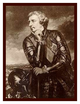
This is some text with an embedded image <img src="ljamherst.jpg" width="175" height="228" alt="Lord Jeffery Amherst">,
representing a certain British peer.
This is some text with an embedded image
,
representing a certain British peer.
Images are known as replaced elements, because their content is brought in from outside the document.
The image element includes a number of new attributes, to be discussed in turn.
The Image Source Attribute
The src= attribute references files on your web server or elsewhere on the web, using a format known as a Uniform Resource Locator (URL).
In the previous example, only the file name ljamherst.jpg is required because the file is in the same folder as the web page itself, a good practice to follow.
If the file is in a folder adjacent to your web page, you can reference it by naming the folder first and separating them with /, such as images/ljamherst.jpg.
If the file is elsewhere on your web server, you can reference it using the sequence .. that describes a parent folder.
For example, in the URL ../otherimages/ljamherst.jpg,
the folder otherimages is a sibling to your web page’s folder because they share the same parent.
The three examples above are what are known as relative URLs because they don’t say anything specific about your server; this format is highly recommended when the files are expected to remain associated with your web page.
A source file can also be referenced from any other web site with a full URL such as you would type into a browser’s location field:
<img src="http://www.nws.noaa.gov/radar/images/DS.p19r0/SI.kbox/latest.gif" width="310" height="310" alt="NWS Boston Radar">
Be very careful when grabbing an image from another server, however; few people will appreciate your use of their server to display their image outside of theirintended presentation!
Other Image Attributes
The width= and height= attributes describe the screen area to be used for the image; if the image is different in size, the browser will scale it to fit.
You can use one or the other of width= and height= to ensure a proportional scaling; if you use both you can stretch the image to any rectangular shape.
Even if you are displaying the picture at its actual size,
providing width= and height= is a good idea, as it will speed the page’s layout and the picture’s display.
The alt= attribute is used to provide a textual description of the image,
which can help those using screen readers or text-only browsers, so it is always a good idea to use it.
1.4. Exercises
Locate a web-compatible image somewhere on your computer
(e.g. in My Pictures on a Windows computer or in Macintosh HD : Library : User Pictures on a Mac),
and copy it to the same place as your class.html file.
Using Dreamweaver’s Code View, type into class.html an <img> tag like the above,
with all of the same attributes (save the result when done).
Switch to Design View to see the result.
Spans and hyperlinks can be applied to both text and images, to provide internal and external references and other benefits.
The Span Element
The in-line container span element <span>....</span> can be wrapped around any piece of text or an image or any combination to give it a meaning of your choosing, or to provide a reference for some application.
Although it looks similar to the phrase elements above, by itself a <span> element is generic and so carries absolutely no formatting.
To become useful the <span> element needs an attribute that makes it non-generic.
The Identifier Attribute
The identifier attribute id= can be used with <span> or any other element, to uniquely identify this element relative to all others in the document.
A particular value for id= must therefore not be used more than once in a document.
An identified element can:
have a specific CSS style applied to it (to be discussed later);
be controlled more easily by JavaScript (to be discussed later);
provide a location reference from both within and without this web page:
I want to be able to locate this
<span id="info">very important bit of information</span>
with a unique reference.
I want to be able to locate this very important bit of information with a unique reference.
The location of an identified element is referenced by preceding the attribute value with the
hash character # (aka sharp, pound, or octothorpe), e.g. #info.
If the location is in another document, the reference is appended to its URL, e.g. filename.html#info (same server) or
http://www.server.dom/filename.html#info (different server).
Identifiers must begin with an ASCII letter [A-Za-z] but after that they may also include digits [0-9], hyphens [-], underscores [_], colons [:], and periods [.].
Watch out: identifier values are case-sensitive!
The Anchor Element
One of the most common in-line container elements is the anchor element
<a>....</a>.
It has a very important use with which you are all familiar:
its href= attribute defines a hypertext link,
or hyperlink, or even just link for short, which is a URL that will lead away to another web page when you click on the text contained by the element:
Let's provide this British peer with some context by making his image a hyperlink:<br> <a href="http://www.blupete.com/Hist/BiosNS/1700-63/Portraits/Amherst.htm" target="_blank">
<img src="ljamherst.jpg" width="175" height="228"
alt="Lord Jeffery Amherst">
</a><br> Here's a <a href="http://www.blupete.com/Hist/BiosNS/1700-63/Amherst.htm">
biography of the man </a>
, and here's the book the image is from: <a href="http://www.ourroots.ca/e/toc.asp?id=1596" target="_self">
<cite>
Old Quebec, the Fortress of New France </cite>
</a>.
By default, image links have an extra border, and text links have an underline style, which you have probably seen many times online.
The Anchor Target Attribute
When loading a new web page, the anchor element can also observe a target= attribute.
If target= has the value _blank, the page will open in a new window, as happens with the first link above.
The default value for target= is _self, which replaces the current document, as occurs with the second and third links above.
The Anchor Name Attribute
As discussed above, the destination URL of an anchor element's href= attribute may be a location inside of a document, by including # and an element's id= attribute.
Traditionally, an anchor element served not only as the launching point to a URL, but can itself be an internal destination, by assigning it a name= attribute:
<p>
<a name="DestinationAnchor">Destination anchor</a><br> <a id="DestinationElement">Destination element</a><br> ... intervening content ...<br> <a href="#DestinationAnchor">Go to the destination anchor</a><br> <a href="#DestinationElement">go to the destination element</a>
</p>
As you can see, the first two lines serve exactly the same purpose.
Because they can be used in the same way, anchor names and element identifiers share the same namespace, and collectively should be unique within a document.
Although the anchor name= attribute is commonly used, it is good practice to avoid it and only use the id= attribute, because:
The id= attribute is more general, being usable with any element;
Using only one attribute type helps to avoid overlapping names;
It reduces confusion about the purpose of the <a> element by reserving it primarily for launching hyperlinks.
1.5. Exercises
Use Dreamweaver’s Code View to add a <span> element like the above,
with an id= attribute, for some part of the text you’ve previously entered in class.html.
Switch to your browser, open class.html and find the location field where this file is referenced. Add # and your id= value to the end of the location,
then press the Enter key to go to that location in your page.
In your browser, visit some website you’re familiar with, and copy its URL address from the location field.
Switch back to Dreamweaver, and in Code View add an <a> element to your page, either surrounding some text or an image. Paste the URL selected in step (3) as the value for the href= attribute.
Also, add another <a> element that references the <span> element defined in step (1).
Return to your browser, reopen class.html, find these two links, and click on them to test them.
Horizontal rules and divisions provide simple ways to structure text for easier cognition.
Block Elements
The break, phrase, image, span, and anchor elements in the previous sections are all in-line elements, because they generally occur in the middle of text and elaborate on its meaning.
When it’s time for a change of context, however, another general type of element, the block element, will come into play.
The name comes from the fact that such elements will always force a new line (or cell in the case of table columns), display any content, and then end with another new line (or cell wall), setting themselves off in a block.
Like in-line elements, block elements can be both stand-alone and containers.
While in-line container elements can contain only text and other in-line elements, a general characteristic of a block container is that it can encompass, in addition, other block elements (although there are some important exceptions).
The Horizontal Rule Element
The horizontal rule element <hr> is a simple example of a block stand-alone element that visually forces a change in context:
Lord Pelham merely passed through the Massachusetts town that bares his name.<hr>Now we come to a more prominent figure, Lord Jeffery Amherst, who lent his name to numerous towns.
Lord Pelham merely passed through the Massachusetts town that bares his name.
Now we come to a more prominent figure, Lord Jeffery Amherst, who lent his name to numerous towns.
Note that by default the horizontal rule extends the width of its containing element.
The Division Element
The container division element <div>....</div>
is the block-level version of the in-line <span> element.
It will generate a new line before and after itself, but otherwise impose no formatting on its contents:
<div>Here the text and embedded image are contained within two division containers.</div><div>
<img src="ljamherst.jpg" width="175" height="228" alt="Lord Jeffery Amherst"></div>
Here the text and embedded image are contained within two division containers.
While a <br> element would have had the same visual effect, the structural effect is that of two distinct items within containers, which might later be given unique identifiers and/or styles.
1.6. Exercises
Use Dreamweaver’s Code View to add <hr> elements to some part of the text you’ve previously entered in class.html.
Switch to Design View to display the result.
Now switch back to Code View and add a <div> element to some part of the text.
Switch to Design View to display the result; do you notice any difference?
Paragraphs and headings are common block container elements that impose standard formatting on their contents.
The Paragraph Element
We have already seen the block paragraph element <p>....</p>,
which is similar to the <div> element,
but will always provide some space between itself and a following element:
<p>Here the text is in a paragraph while the embedded image remains in a division container.</p><div>
<img src="ljamherst.jpg" width="175" height="228" alt="Lord Jeffery Amherst"></div>
Here the text is in a paragraph while the embedded image remains in a division container.
Unlike most HTML container elements, the closing </p> tag is optional,
being implied by a subsequent block-level element (such as another <p>, a common occurrence).
The consequence of an optional end tag is that the <p> element cannot contain other block elements.
It is a good idea to always include an end tag, however,
as they will be required if you ever update your document to the newer XHTML standard.
are intended to hold relatively short pieces of text (headers or titles) describing the content of the document, chapters within that document, sections within those chapters, subsections within those sections, etc.
As such, they are usually set in bold face and diminish in size:
It’s not required that, for example, <h1> be used to describe the document, but it’s generally advisable to use the headers in a consistent fashion (more important having lower-numbered headers).
Note that like the paragraph element <p>,
these elements by default have some space after them to visually separate them from subsequent elements.
1.7. Exercises
Use Dreamweaver’s Code View to add some <p> and <h1>, ...., <h6> elements to some part of the text you’ve previously entered in class.html.
Switch to Design View to display the result; how do the headings differ from the paragraph?
Lists provide an ordered structure to display sets of information, and can be unordered, ordered, or definition.
The Unordered List Element
The unordered list is the simplest list, which simply indents each item in the list and precedes them with a "bullet" symbol.
The block unordered list element <ul>....</ul> is used to enclose the entire list.
Each item in the list is then set off with the in-line list item element <li>....</li>:
If a second level of list is desired, another <ul>....</ul> or <ol>....</ol> block can be inserted inside the first (and these can be mixed).
The interior list will be indented further, and in an unordered list the bullet symbol will usually change to distinguish it:
<ul> <li>Amherst College</li> <ul><li>Founded 1821</li><li>Located in Amherst, MA</li><li>Men-only initially; Coed since 1975</li></ul> <li>Hampshire College</li> <ul><li>Founded 1970</li><li>Located in Amherst, MA</li><li>Coed since founding</li></ul> <li>Mt. Holyoke College</li> <ul><li>Founded 1837</li><li>Located in South Hadley, MA</li><li>Women-only since founding</li></ul> <li>Smith College</li> <ul><li>Founded 1871</li><li>Located in Northampton, MA</li><li>Women-only since founding</li></ul> <li>University of Massachusetts</li> <ul><li>Founded 1867</li><li>Located in Amherst, MA</li><li>Men-only initially; Coed since 1892</li></ul> </ul>
Amherst College
Founded 1821
Located in Amherst, MA
Men-only initially; Coed since 1975
Hampshire College
Founded 1970
Located in Amherst, MA
Coed since founding
Mt. Holyoke College
Founded 1837
Located in South Hadley, MA
Women-only since founding
Smith College
Founded 1871
Located in Northampton, MA
Women-only since founding
University of Massachusetts
Founded 1867
Located in Amherst, MA
Men-only initially; Coed since 1892
The Definition List Element
Definition lists are designed for term-definition pairs of information.
Such a list uses the block definition list element
<dl>....</dl> to enclose the entire list.
Each term-definition pair in the list is then set off with the in-line definition term element
<dt>....</dt> (end tag optional) followed by
the block definition element <dd>....</dd> (end tag optional):
<dl> <dt>Amherst College</dt><dd>Founded in 1821 in Amherst, MA.</dd> <dt>Hampshire College</dt><dd>Founded in 1970 in Amherst, MA.</dd> <dt>Mt. Holyoke College</dt><dd>Founded in 1837 in South Hadley, MA.</dd> <dt>Smith College</dt><dd>Founded in 1871 in Northampton, MA.</dd> <dt>University of Massachusetts</dt><dd>Founded in 1867 in Amherst, MA.</dd> </dl>
Amherst College
Founded in 1821 in Amherst, MA.
Hampshire College
Founded in 1970 in Amherst, MA.
Mt. Holyoke College
Founded in 1837 in South Hadley, MA.
Smith College
Founded in 1871 in Northampton, MA.
University of Massachusetts
Founded in 1867 in Amherst, MA.
1.8. Exercises
Use Dreamweaver’s Code View to add an unordered list <ul> element to your class.html file.
Duplicate the same data but make it an ordered list with an <ol> element.
Finally, create an ordered list with a <dl> element.
Switch to Design View to display the result; how do the lists differ?
Tables provide a general approach to structuring sets of data.
The Table Element
With the definition lists in the last section we begin to see an ordered table of data,
but limited to two columns (the term and definition).
HTML provides a general method to structure a set of related data, using the block container table element <table>....</table>.
Between these tags, the table consists of a series of block container
table row elements <tr>....</tr> (end tag optional).
Each table row is then broken into a series of columns by either table data elements
<td>....</td> or
table header elements <th>....</th> (both with optional end tags):
<table> <tr> <th>School</th><th>Location</th><th>Founded</th><th>Coeducational Status</th> </tr> <tr> <td>Amherst College</td><td>Amherst</td><td>1821</td><td>Men-only initially; Coed since 1975</td> </tr> <tr> <td>Hampshire College</td><td>Amherst</td><td>1970</td><td>Coed since founding</td> </tr> <tr> <td>Mt. Holyoke College</td><td>South Hadley</td><td>1837</td><td>Women-only since founding</td> </tr> <tr> <td>Smith College</td><td>Northampton</td><td>1871</td><td>Women-only since founding</td> </tr> <tr> <td>University of Massachusetts</td><td>Amherst</td><td>1867</td><td>Men-only initially; Coed since 1892</td> </tr> </table>
School
Location
Founded
Coeducational Status
Amherst College
Amherst
1821
Men-only initially; Coed since 1975
Hampshire College
Amherst
1970
Coed since founding
Mt. Holyoke College
South Hadley
1837
Women-only since founding
Smith College
Northampton
1871
Women-only since founding
University of Massachusetts
Amherst
1867
Men-only initially; Coed since 1892
Note the different formatting for the <th> elements (first row)
compared to the <td> elements;
otherwise they are equivalent.
Note also that these two elements are both block container elements,
but that they force new columns in addition to new lines.
Spanning Columns and Rows
Generally speaking there will be an equal number of data/header elements specified for each row, but that isn’t required, and the row with the largest number determines the number of columns in the table (unspecified columns in the other rows are left blank).
It’s possible for a data/header element to span more than one column with the colspan= attribute,
or a number of rows by specifying the rowspan= attribute:
<table> <tr> <th colspan="4">The Five Colleges</th> </tr> <tr> <th>School</th><th>Location</th><th>Founded</th><th>Coeducational Status</th> </tr> <tr> <td>Amherst College</td><td rowspan="3">Amherst</td><td>1821</td><td>Men-only initially; Coed since 1975</td> </tr> <tr> <td>Hampshire College</td><td>1970</td><td>Coed since founding</td> </tr> <tr> <td>University of Massachusetts</td> <td>1867</td><td>Men-only initially; Coed since 1892</td> </tr> <tr> <td>Smith College</td><td>Northampton</td><td>1871</td><td>Women-only since founding</td> </tr> <tr> <td>Mt. Holyoke College</td><td>South Hadley</td><td>1837</td><td>Women-only since founding</td> </tr> </table>
The Five Colleges
School
Location
Founded
Coeducational Status
Amherst College
Amherst
1821
Men-only initially; Coed since 1975
Hampshire College
1970
Coed since founding
University of Massachusetts
1867
Men-only initially; Coed since 1892
Smith College
Northampton
1871
Women-only since founding
Mt. Holyoke College
South Hadley
1837
Women-only since founding
Note that the second and third rows shouldn’t even have the second column specified, as it is filled in from the first row.
1.9. Exercises
Use Dreamweaver’s Code View to add a <table>
to your class.html file; don’t make it too big, only or two or three rows and columns.
Switch to Design View to display the result.
Now use Dreamweaver’s Design View to create the exact same table, as you learned previously.
Which one takes less time to create?
Switch to Code View and add one column and one row span.
Switch to Design View to display the result.
Forms let a user provide data to the browser or the web server...but it must know how to process it.
Forming User Input
Forms provide various ways for users to enter data to be analyzed by the browser or sent back to the web server for processing and/or storage in a database.
Because of the many types of input elements, forms are the most complex HTML element we will consider here.
For a form to be useful, however, you must use JavaScript to tell your browser how to analyze it,
or your web server must have software installed that can process and/or store it, for example PHP (preferred) or Perl (available).
Forms processing is beyond the scope of this document, so we will focus on simply setting forms up for later application.
The Form Element
Every form begins with a block container form element
<form>....</form>.
Between these tags, the form consists of a number of in-line elements that respond to user input:
container textarea elements <textarea>....</textarea> for large quantities of text;
stand-alone input elements <input> distinguished by the attribute type for short pieces of text or user clicks; and/or
container select elements <select>....</select> for selection from a menu.
All of these have a name= attribute that the application can use to reference the input data, and a means to choose a value to hand to a forms-processing application.
The Textarea Element
The textarea element is an input field for a large quantity of text, such as feedback on a website:
<form> Tell a story about your college: <textarea name="collegeStory" cols="60" rows="3">Calvin Coolidge, the 30th president of the United States, was a graduate of Amherst College.</textarea> </form>
You can choose the size of the input field with the cols= and
rows= attributes, whose values specify the number of columns (characters wide) and rows, respectively.
You can also provide initial text for the input field between the tags <textarea>....</textarea>.
Typing text into the text field will change it, and that text along with the value of the attribute name= are what will be passed on to a forms-processing application.
The Text Input Element
Small amounts of text (without new lines) can also be recorded with
the <input> element and an attribute="value" of type="text" (the default value):
<form> What is the name of your college: <input type="text" name="collegeName" size="30" maxlength="50" value="Amherst College"> </form>
Here the size= attribute corresponds to
the cols= attribute of <textarea>,
and there is an additional attribute maxlength= that sets a maximum number of characters for the input.
In addition, the default text of the input field isn’t included between the tags as with <textarea>,
but instead is the initial value of the attribute value=.
Changing the content of the text field changes the value of value=,
and this value together with the value of name= are what will be passed to a forms-processing application.
The Radio Button Input Element
If you want to give people a specific set of options from which to make a single choice,
the <input> element can be used with
an attribute type="radio" to create a series of radio buttons.
There must be one <input> element for each radio button,
but all are part of a single group identified by the shared value of the name= attribute:
<form> What is your college:<br> <input type="radio" name="collegeRadio" value="Amherst College" checked> Amherst College<br> <input type="radio" name="collegeRadio" value="Hampshire College"> Hampshire College<br> <input type="radio" name="collegeRadio" value="Mt. Holyoke College"> Mt. Holyoke College<br> <input type="radio" name="collegeRadio" value="Smith College"> Smith College <input type="radio" name="collegeRadio" value="University of Massachusetts"> University of Massachusetts </form>
Note that the button labels are included simply by positioning normal text.
The values of value= are not seen by the user, and could be anything you choose, e.g. "1", "2", "3", and "4" (and might even include overlapping values).
Clicking a particular button sets the "group" value= to that of the particular button,
and this group value, together with the value of name=, are what will be passed to a forms-processing application.
It is often useful to preselect a particular button,
by including the boolean attribute checked (you probably wouldn’t want this for a survey, though, as it predisposes a particular answer).
The Checkbox Input Element
If you instead want to provide a specific set of options from which more than one choice might be made,
a series of checkboxes can be generated with the <input> element and
an attribute type="checkbox".
As with the radio buttons, there must be one <input> element for each checkbox,
but here they not part of a single group but instead unassociated elements (except by spatial layout):
<form> Where have you taken classes?<br> <input type="checkbox" name="AmherstCollege">
Amherst College<br> <input type="checkbox" name="HampshireCollege">
Hampshire College<br> <input type="checkbox" name="MountHolyokeCollege" checked>
Mt. Holyoke College<br> <input type="checkbox" name="SmithCollege">
Smith College<br> <input type="checkbox" name="UniversityOfMassachusetts">
University of Massachusetts </form>
As with radio buttons the labels are included simply by positioning normal text.
For checkboxes, the initial value of the attribute value= is off,
unless the attribute checked is included, in which case it is on.
It’s also possible to set completely different "on" values for value=,
e.g. value="hot".
Again the values of name= and value= are what will be passed to a forms-processing application, but only for each checkbox that is checked.
In a situation where you might consider using two radio buttons with opposite meanings, e.g. on/off, yes/no, etc., a single checkbox labeled with the positive value is generally a better choice.
The Submit Input Element
In order to submit the form to a forms-processing application, a definite action is required on the part of the user, and this usually occurs by clicking on a submit button.
The submit button is created with an <input> element and
an attribute type="submit":
A generic button will only function in conjunction with JavaScript (to be discussed later).
The Select Element
If you have a list of items from which a user must make a selection, and:
there are more than can comfortably be displayed with a set of radio buttons or checkboxes, and
the list is well enough defined that a user doesn’t need to easily see all of the options (e.g. a list of states),
then a menu is probably a good way to present the selection.
A menu is created with a block select element <select>....</select> that contains a set of block option elements <option>....</option> (end tag optional), each containing one menu item:
By default the menu shows the first item in the list; if you want to specify another item as the initial selection, include the boolean attribute selected in its <option> element:
With the attribute multiple, a browser will more than likely display a scrolling list box rather than a pop-up menu.
The number of items displayed in a scrolling list box can be changed with the attribute size= in the <select> element, as shown.
The TabIndex Attribute
When a form element is selected for input, it is said to have received the user focus.
The various form elements on a web page can be accessed from the keyboard with the tab key, which ordinarily moves you through the page in the order the elements are described (shift-tab takes you backwards).
With the attribute tabindex= and a numeric value, you can control this tab order:
<form name="tab">
What is the name of your college: <input type="text" name="collegeName" size="30" maxlength="50" value="Amherst College" tabindex="2"><br>
Where have you taken classes?<br> <input type="checkbox" name="AmherstCollege" tabindex="1">
Amherst College<br> <input type="checkbox" name="HampshireCollege" tabindex="3">
Hampshire College<br> <input type="checkbox" name="MountHolyokeCollege" checked tabindex="4">
Mt. Holyoke College<br> <input type="checkbox" name="SmithCollege" tabindex="5">
Smith College<br> <input type="checkbox" name="UniversityOfMassachusetts" tabindex="6">
University of Massachusetts<br> <input type="submit" name="collegeFormSubmit" tabindex="7"> <input type="reset" name="collegeFormReset" tabindex="8"> </form>
This attribute is particularly useful if elements are repositioned with CSS.
1.10. Exercises
Use Dreamweaver’s Code View to add a <textarea> element and an <input type="text"> element to your class.html file.
Open the file in your web browser to display the result.
Enter some text in the text fields; how do they differ?
Now use Dreamweaver’s Code View to add several types of <input> element to your class.html file: radio, checkbox, submit, and reset.
Reload the file in your web browser to display the result, and click on the various controls to see their effects.
Finally, use Dreamweaver’s Code View to add a list in a <select> element to your class.html file, and add tabindex= attributes to each form element.
Again reload the file in your web browser to display the result, and click on the list to see how it works, including tabbing.

 ,
representing a certain British peer.
,
representing a certain British peer.
